Saturday, 30 July 2011

Edvard Munch's The Scream-inspired artworks

By Tom N. (yr 3 student)
fear of black holes
By Kaya (Yr 3 student)
fear of time
  
Lesson Background:
At the end of the last school term our school held a "health week", where we discussed issues relating to physical, emotional and mental health.  We also discussed child protection issues and how children can "listen to their bodies" when they are in uncomfortable situations (clammy hands, faster heartbeat, sweating, butterflies in tummy, etc).  I thought this topic lent itself to studying the life and art of Edvard Munch and creating an artwork based on his most famous work "The Scream". My idea was to colour a template of "The Scream" using oil pastel and then where the 2 figures are in the background of Munch's original artwork, the children would paste a picture/photo of something that frightens them.

Lesson Steps:
1)  We studied a child-friendly biography of Edvard Munch's life, discussing what sort of artworks we thought he might create, based on the events in his life.
2)  I showed the students pictures of some of his artworks and we discussed his use of line, style, colour, shape etc.
3)  I displayed "The Scream" for the students and asked them to identify what objects were in the painting, how the painting made them feel and what they thought it was called (some very interesting responses!).
4)  We discussed the features and meanings of the artwork.
5)  Students were then asked to brainstorm things we are afraid of, things that worry us or things that make us uncomfortable.  I asked the students to choose 1 fear/worry that they would like to portray in the artwork and I made a list of these fears.  Later that day I used the Internet to find photos of each child's chosen fear, printed them out in colour and stored them away for when the children had completed the colouring of their artworks.
6)  I gave the students a stencil of "The Scream" (found on Google images) and demonstrated how they might like to use the oil pastel to colour each section (ie. water, sky, hand-rail, figure, etc).  After I had demonstrated ideas for a section, they went back to their desks and completed that section on their own artwork.
7)  The students were encouraged to use and blend in multiple colours and to use swirling lines (we had discussed how the movement of the lines and the use of colours added to the mood of fear and overwhelming).
8)  When the artwork was completed, the students selected a photo or picture of their fear, cut it out (no background, just the main image) and stuck it behind their figure on the artwork.  I suggested they make the eyes of the figure look back at the object of their fear.
9)  Students cut out their artwork and backed them on black cardboard.

Year 3 Student Artworks:


By Tim (fear of war)


By Olivia (fear of stingrays)

By Parth (fear of sharks)


By Dane (fear of aliens)

my sample artwork to guide the children (and my fear of needles!)

By Jia (fear of burglars)

By Angus (fear of zombies)


By Dharan (fear of sharks)

By Charlotte (fear of aliens)


By Keyan (fear of ghosts)


By Liam (fear of war)

Wednesday, 22 June 2011

Bruce Gray Animal Oil Pastels


By Janis (year 3 student)
Lesson Background:

Our school had an RSPCA fundraiser last week and so I thought my class would enjoy creating some animal-inspired artworks!  I trawled through Google images and came across the stunning artworks of Bruce Gray.  We based these artworks on Gray's oil pastel drawings...


"Picattso #7" original Bruce Gray artwork that inspired us
Lesson Steps:

1)  We read a brief biography of Bruce Gray.
2)  We looked at photos of his artworks and discussed his use of colour, shape and line.
3)  The students were each given an A3 sheet of art paper.  I demonstrated how to draw large boxes of different shapes and sizes all over the page, which locked in together like jigsaw pieces.
4)  I then demonstrated how to draw simple body parts of animals from different angles (teeth, tails, claws, whiskers, legs, fur, etc).  As I demonstrated each drawing, the children chose one of their boxes on their artwork and copied the body part inside it. 
5)  Once I had demonstrated a range of body parts, the children filled in the rest of the boxes by repeating the body part drawings in different places and using different angles.
6)  I then demonstrated how to outline each shape in coloured oil pastel, colour it in and then use lighter or darker colours to add light and shading.  I also suggested how they could use interesting colour combinations to make their shapes and patterns stand out (e.g. red and yellow, pink and green, purple and orange).
7)  The students coloured their own artworks in, being careful to colour thickly and with no white gaps.
8)  I showed the students how to outline every box and shape with black oil pastel.  The students then went back and outlined their own artworks.

Year 3 Student Artworks


By Andrew (Year 3 student, 2011)


By Andrea G


By Kaya


By Arpita


By Charlotte


By Tom N. (Year 3 student, 2011)


By Charlotte, Andrew, Nick, Dharan. Keyan and Kaya

By Andrea G, Tom N, Aimee, Arpita, Jia and Liam


By Denzelle, Parth, Dane, Kundai, Shaun and Olivia

By Josh and Axel

A sample artwork I made to help guide the students


some of 3B's beautiful oil pastel drawings

Matisse Dancers Paper Artwork

By Tom N. (Year 3 student, 2011)

Lesson Background:
This lesson idea came from the Deep Space Sparkle website: http://www.deepspacesparkle.com/2009/02/matisse-inspired-dancers-paper-collage/

Lesson Steps:
1)  Discuss the art of Matisse, including his artwork, "The Dance" (1909).
2)  Talk about his use of colour, shape, line and movement.
3)  Discuss how Matisse made sure the gaps between his shapes were just as interesting to look at (positive/negative space).
4)  Ask the children to take these ideas and design a background of shapes and blocks of colour.  The children can do a few sketches of ideas on scrap paper, then cut their shapes out of coloured Brenex paper and stick it onto an A3 sheet of white art paper.
5)  Show the students how to draw a person by drawing a stick figure in different poses/movements and then covering each segment of the figure with a simple bean or leaf-shape.  Explain how segments are the parts of the body separated by joints (e.g. an arm has 3 segments:  above elbow, below elbow and hand). 
6)  Student draw their body/ies in different movement positions onto black paper.  Then students cut the paper out and glue it onto their backgrounds.
7)  Show the students how they can decorate their people with coloured paper headbands, necklaces, armbands, ankle bands, chest bands, etc.

Year 3 Student Artworks (2011)


By Andrea


By Keyan


By Jia

By Charlotte


Saturday, 14 May 2011

Chuck Close Portraits


By Amber, 2011

Year 3 student, 2011

Lesson Background:

I got the idea for this lesson from the art blog:  "Art Projects for Kids" http://www.artprojectsforkids.org/2007/12/chuck-close-self-portrait.html
I have changed a few things though:  I did not use photos as a base for the artworks- we just drew in faces.  Also, I asked my students to use progressos rather than normal pencils, textas or crayons, to make these portraits really stand out.

Lesson Steps:

1.  Talk about the artist, Chuck Close.  I used a PowerPoint presentation with a brief biography and photos of some of his artworks.  Discuss his style and techniques. 
2.  Provide students with a sheet of A4 grid paper.
3.  Demonstrate how to draw a face, neck and shoulders onto the grid paper (use helpful measurement information such as, 3 squares from the left and 2 squares down, start drawing the side of the head, following the line, etc).
4.  Show students how to draw in eyes, nose and mouth. 
5.  Ask the students to outline their drawing with black progresso when they are happy with it.
6.  Ask the students to colour in the lips red/pink and the eyes in whatever colour their own eyes are.
7.  Revise the concept of warm and cool colours.  Tell the children they will choose 2 warm colours for the face/ears/neck, 1 warm and 1 cool colour for the shirt (stick to light colours that stand out), and 2 cool darker colours for the background. 
8.  Remind the students of how Chuck Close filled each grid square with patterns and shapes.  Brainstorm ideas for patterns and shapes they could use in each of their squares.
9.  Send the children back to begin their artworks.
10.  When all the colouring is done (make sure they press firmly and leave no white gapes), the students can go over the black outlines.
11.  Back the artworks on black cardboard.

Year 3 Student Artworks:


By Andrea G, 2011
 
By Charlotte, 2011


Year 3 student, 2011
 
Year 3 student, 2011

 
By Denzelle, 2011


Year 3 student, 2011


By Nomvula. 2011
   
By Parth, 2011


some of the 3B artworks,2011


Year 3 student artwork, 2011


Saturday, 7 May 2011

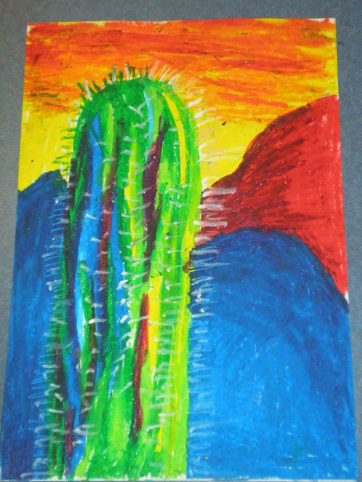
Desert Cactus Oil Pastel Drawings

3B Desert drawings, 2010
Lesson Background:

I designed this art lesson as a part of an Integrated Studies unit of work on animal and plant adaptations.  We had been learning about desert environments and the adaptations of desert plants, including the cactus.  I went searching for cactus artworks on Google Images and found a few beautiful ones that I showed the students.  From these images, I designed the layout of this artwork.

Lesson Steps:

1.  Students were given an A4 sheet of white art paper.
2.  With the students at their desks and me at the board demonstrating step-by-step, I drew in 2 mountain shapes in the foreground.  I then drew in 1 large mountain in the background.  The students followed, creating whatever shapes for the mountains that they liked best (I did tell them that the cactus would be on the left side of the paper, so they would need to put the interesting shapes and curves of their mountains on the right hand side of the paper).
3.  I then drew the basic cactus shape on the left side of the paper (I explained that it was like a column with a rounded top- like a long upside-down 'U' shape.  I also suggested they start their cactus shape approximately 2 finger spaces from the left, to have it stop about 2 finger spaces from the top of the page and about halfway across the paper).
4.  I asked the students to colour nearly the whole sky in yellow oil pastel (leaving just a strip of 2-3 finger spaces blank at the top).  I then asked them to colour the blank strip in red oil pastel.  after this, I showed them how to use orange oil pastel to mix through the bottom of the red and down into the yellow, to create a 3-toned sunset in the sky.
5.  I then demonstrated how to colour the mountains in the foreground.  We started by colouring the whole mountain with dark blue oil pastel.  I then showed the students how to use dark purple and navy to show the shadows and how to use light blue to show the ligher areas.
6.  For the background mountains, we covered them in red oil pastel and then used purple for the shadows and a little orange oil pastel for the lighter areas.
7.  After this we were ready to start on the cactus.  I showed them how to draw in long, pointy, slightly wavy strips all over the cactus.  I explained how most of the right side of the cactus would be light green (where the sunset was shining) and most of the left side of the cactus would be dark green (in the shadows).  In between, would be mostly filled with other light colours (pale blue and yellow strips) on the right side, and mostly darker colours (dark blue, navy blue, dark purple) on the left side.  I demonstrated how to do this and explained the importance of leaving no gaps.
8.  When the picture was complete, I showed the students how to use the sharp edge of a white oil pastel to draw small spines going around the outside of their cactus.  I then showed them how to create lines of spines inside the cactus as well. (I had originally tried to do the spines by just scraping away lines in the oil pastel, but I found it didn't show up very well- you couldn't see them unless you were right in front of the artworks!)

Year 3 Artworks:


Year 3 artworks, 2010

Keith Haring Moving Figures

some my Year 3 students' artworks, 2010
Lesson Background:

I designed this activity based on an idea I got from the Deep Space Sparkle website: http://www.deepspacesparkle.com/2008/06/keith-haring-inspired-ceramic-mural/
My class was studying a unit of work on healthy lifestyles, including exercise, self-esteem, friendships and relationships.  The unit seemed to be summed up nicely through Keith Haring's art.

Lesson Steps:

1.  We read an edited, child-friendly biography of Keith Haring's life.
2.  I showed the students a range of his artworks on the class interactive whiteboard and we discussed his art style, his use of line, colour, shape, movement and what he was trying to communicate in his artworks (love, tolerance, unity etc).
3.  We talked about how he showed movement through the use of movement lines.
4.  I gave the students some pictures of Keith Haring's artworks to look at and to help them draw their own moving figure/s.  For those that were struggling to draw their own figure, I allowed them to trace up to half of the body from one of the Keith Haring's figures I had given them.  They then had to draw in the rest themselves.
5.  The students then traced or copied their figure/s onto coloured brenex paper. 
6.  I then asked the students to consider what shapes or blocks of colour they would like in the background.  We re-looked at Keith Haring backgrounds and talked about how he used images like hearts, simple shapes and strips of colour.  The children then designed their own background, cut it out of coloured Brenex paper and stuck down their background and figure/s on a sheet of A4 card.
7.  We then came back together on the floor and experimented with drawing movement lines on figures I had drawn on the whiteboard.  Gradually we worked out together, where these lines should go and how to draw them best.  We decided they looked like "rainbows" and "curved around" the part of the body that was moving.
6.  The children went back to their desks and then drew movement lines onto their artworks (I suggested between 2 and 4 sets per figure).  They did this in lead pencil first and then when they were satisfied with them, they traced over the lines in black texta.
7.  I then asked the students to trace around the outside of their figures in black texta to make them stang out.

Year 3 Artworks, 2010:


3B artworks (we tried multiple figures in 2009)


Sample artwork I made to help guide the class