Saturday 15 December 2012

Ice cream Paintings

My sample artworks
Note:  Unfortunately, you can probably see the difference between the vibrancy of colour in my sample paintings done at home (with good quality acrylics) and the children's artworks below that were done at school using cheap and runny school paints!  It would have been lovely to have had good quality paints at school for the children!
Lesson Background:
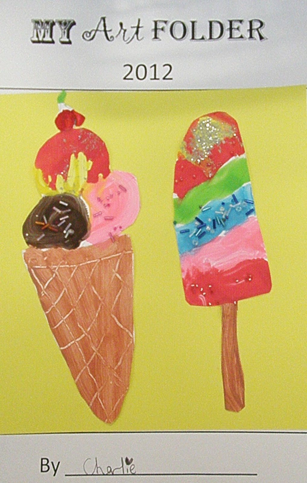
This lesson idea came from the Usborne Activities book "Summer things to make and do": http://www.usborne.com/catalogue/catalogue.aspx?id=2322

Lesson Materials:

-  Acrylic paints mixed with PVA glue in any colours desired for different flavoured ice creams (e.g. brown for chocolate, pink for strawberry, green for lime, orange for mango, white for vanilla, etc)-Use the thickest, best quality paints you can
-  Light brown acrylic paint for the cones and paddlepop sticks
-  Paintbrushes
-  Newspaper to lay under the artworks
-  Lead pencils and rubbers for the initial drawing
-  Small coloured shiny beads (round and sprinkle-shaped)
-  Fine silver glitter
-  A squeezy bottle filled with a lot of PVA glue mixed with red paint (for strawberry sauce)
-  2-3 sheets of art paper per child (I used A4 paper and cut the tops off to make squares)

Lesson Steps:

1.  Show the students how to draw 3 different types of ice creams/icy poles and as you do each one, ask the students to follow along and draw their own.  Students should be encouraged to "make it their own" by deciding how many scoops of ice cream they want, what flavours they want, whether to use straight or wavy lines to separate different flavours and whether they want to add extra things like cream, cherries, sprinkles, waffles and chocolate flakes.
2.  Students paint the ice cream cones with pale brown acrylic paint and then use the end of their paintbrush to etch a criss-cross pattern into the cone.  Students also paint their paddlepop sticks in the same colour at this point.
3.  Students paint their ice creams.
4.  Before the paint dries, students sprinkle a small amount of glitter and/or beads onto the ice cream.  They must be careful not to get it on the cone.
5.  If desired, students can use the squeezy bottle of "strawberry sauce" and outline along the top of the top ice cream scoop.  They should then hold the paper upright so the "sauce" drips a little down the top of the icecream.
6.  Do create a chocolate flake, students paint a rectangle of dark brown paint poking out of the ice cream.  They then use the end of their paintbrush to etch thin wavy lines up and down the flake.

NOTE:  I made up tubs of each paint colour and put all the glitter and beads in little containers.  I then laid them all out on different tables around the room with paintbrushes beside each paint colour.  The children were told to "walk around with your painting rather than your paintbrush" and go to the table that had what they needed.  They were reminded not to run and to carry their artwork flat to avoid drips.  This worked quite well.

Year 1 & 2 Student Artworks:


Thursday 15 November 2012

Watercolour Koi Fish

By Eve (Year 1)
Lesson Background:
We did this artwork as a fun culminating activity to celebrate the wonderful watercolour painting unit we have been doing this term.  The lesson is based on one I found on a great art education blog called Art Projects for Kids: http://www.artprojectsforkids.org/2012/03/koi-fish-painting.html

Lesson Materials:
-  Watercolour paints (we used tube ones which are nice, but palettes are easier for the   kids and less messy for the teacher)
-  1 thin, medium and thick paintbrush per child
-  1 clean water container per pair
-  1 dirty water container per pair
-  1 serviette per person (to wipe wet or dirty brushes on and to "lift out" unwanted watery messes!)
-  1 sheet A3 watercolour paper per child
-  1 black permanent marker per child
-  1 lead pencil per child
-  1 eraser per child
-  The "How to Draw" stencil of a koi fish (as mentioned above)

Lesson Steps:
1.  We looked at photos and artworks of koi fish.  We looked at the way artists represented their movement. in water  We also talked about possible ideas for colours, patterns and pond plants that they could include in their artworks.
2.  I showed the students the "How to Draw" stencil from Art Projects for Kids.
3.  I then modelled how to use it to draw the fish.  I also modelled how to draw a basic lotus flower and lily pad. 
4.  SMy students then drew their own fish artwork.  I encouraged them to have as many fish as they wanted travelling in whatever direction they wished.  I also told them to think up their own unique colours, patterns and any other added details for their artwork to make them all different and special.
5.  After the drawings were completed (up until this point, it had taken us about 25 minutes), I modelled how to use the watercolour paints and brushes to colour in the patterns of each fish (splodges, stripes, spots, etc).  We discussed the importance of not painting the rest of the fish so that the colours from the patterns didn't bleed.
6.  The students painted their fish patterns, lily pads and flowers.
7.  I modelled how to paint around the patterns to fill in the rest of the fish. 
8.  The students painted the rest of their fish.
9.  While their fish were drying, I modelled how to paint the water with a large brush, using smooth even strokes.  We discussed the different possiblities of water colours (plain blue, blue/green, blue/purple, etc).
10.  The students went back and prepared a big puddle of their water colour.  They then painted their backgrounds.
11.  The students let their artworks dry.  Afterwards, some went back to tidy sections up, use water to smooth out messy strokes, or use a little more fresh paint to brighten up murky sections on their artworks.
12.  When completely dry, the students outline all lines and shapes on their artworks.

All up this lesson took approximately 2.5 hours.

Student Artworks:
By Dora (Year 2)
By Paige (Year 1)

By Sebaga (Year 2)

By Gabe (Year 2)
By Eloise (Year 2)

By Charlotte (Year 2)


By Joss (Year 1)
By Marlo (Year 2)

By Liliana (Year 2)


Some of our class artworks ready to flatten, trim,
back onto cardboard and hang up around our room!

and here they all are!
  

A modelled drawing to show the students what to do


My modelled painting attempt


Thursday 8 November 2012

Watercolour Landscapes

By Sebaga (Year 2)
Lesson Background:
As a part of our watercolours unit this term, we have been learning how to mix watercolour paints, use different types of watercolour washes, use fine detail and use a range of watercolour and art techniques.  I have been amazed at how much my students have learnt in this very challenging unit of work.  This lesson took about 3 hours (1 hour to draw the artwork and paint the large area washes, 1 hour to fill in the smaller finer details and 1 hour to "perfect" the artwork and outline it).  I love these artworks because they remind me of the beautiful Brindabella mountains surrounding our city.  The artwork is based on one I found through Google Images, selected because of its simiplicity, beauty and its use of a variety of techniques the students had been learning about: https://blogger.googleusercontent.com/img/b/R29vZ2xl/AVvXsEipqr-sAL4-SEW2plPhdCQviozU0gtNhQokvhsScRJfrVUVopEVjx-fY3mtI00SwjdjRj873oZP9kq8OJtzNL0VGItJNPk14SlFrXHNWMPFLRIM91pelenbhy1VAhm5vtNrtcGg1YNo3Q/s1600/ab_spring_landscape.jpg

Lesson Materials:
1 sheet A3 watercolour paper per child
1 thin, medium and thick watercolour brush per child
1 palette of watercolour paints from tubes (purple, light green, dark green, brown, blue, yellow)
A serviette or tisse per child (to wipe brush on, dab at drips on artworks, etc)
2 water containers per pair (1 for washing brushes in to clean them & one for clean water to mix with colours)

Lesson Steps:
1.1.  Draw the parts of the picture lightly with a lead pencil. (I modelled how to draw each part using positioning language- "the grass should start about 1 hand space up from the bottom of the page", "the bushes are about 3 finger spaces wide" etc)
2.2.  Paint the sky with a graded blue wash. 
3.3.  Paint a green wash on the grass. Let it dry.Using a dry brush with the bristles splayed out between your fingers, dip the brush into some different shades of green and do quick, short strokes to create grass (Make sure the paint isn’t too watery).
5.4. Paint the bushes with a yellow wash- wet on wet.
5.  “Drop in” light and dark green splodges while the yellow is still slightly wet.  The colours should slightly bleed so that they become fuzzy and blend a little (ie. they don't stay looking like singular splodges but they also don't bleed so much that they completely blend in as one colour).
6.  Paint a solid wash of purple on the mountains.  When nearly dry, add in some blue and dark purple shadows, smoothing out with a slightly wet brush so that the mountains are smooth with no blobs or lines of 1 colour.
7.  When the mountains, bushes and grass are dry, use a small thin brush to paint brown tree trunks. 
8.  Paint the tree foliage with a solid wash of yellow or light green.
9.  While the tree foliage wash is still a little wet, "drop in" light greens and dark greens to create the leaves.  Students could also use wrist flicks or dry brush to create the tree leaves.
10. When the artwork is dry, outline in black permanent marker.
 
Student Artworks:
By Jeff (Year 1)


By Kayla (Year 1)


By Jasmine (Year 1)

By Ashley (Year 2)

By Charlotte (Year 2)


By Eloise (Year 2)

By Paige (Year 1)

1/2B artworks
 

Hundertwasser Watercolour Flowers

By Eve (Year 1)
Lesson Background:
We had a bit of an "art break" last term, as my class were involved in some new and exciting activities (swimming and gymnastics lessons) which took up all our free time outside of core units of work.  This term however, we have some devoted time to an art unit on watercolour painting.  My lovely Year 1/2 class have been studying the skills and techniques of watercolour painting and have been practising using their knowledge to create their own artworks.  We have found watercolour painting (from the 'real' tubes!) a big challenge, but gradually we have become more able to control the brushes, wait for necessary drying times and use the right amount of water.  This lesson was based on the Hundertwasser lesson we did back in Term 1 but involved watercolour paints (as opposed to acrylic) and focussed on colour mixing and using the different techniques we have been learning about in our watercolours unit.

Lesson Materials:
-  2 sheets A3 watercolour paper per child (unfortunately ours hadn't arrived yet, so we  had to use normal art paper---  nowhere near as effective!)
-  Tubes of watercolour paint (a small blob of each colour per pair on a palette)
-  Brushes- thin, medium and thick per child
-  Water (a clean and dirty water jar per couple)
-  A serviette or tissue per child

Lesson Steps:

PHASE 1:  THE FLOWERS
Before starting, we learnt about the colour wheel, what watercolour paints are, how to mix colours and experimented with mixing watercolour paints to make different colours.
1.  On an A4 sheet of watercolour paper, lightly draw or trace 8 circles of different sizes.
2.  Paint one of the circles using a primary colour (yellow, red or blue)
3.  While it is still wet, paint a smaller circle inside it using a different primary colour
4.  Then paint an even smaller circle inside that using the final primary colour.

 
My sample colour mixing flowers

PHASE 2:  THE BACKGROUND
Before starting we learnt about different watercolour washes (solid, graded, variegated, etc) and the "lifting out" technique  and practised painting them.
 1.  Draw in a line for the sky and grass.
2.  Draw in a Hundertwasser-inspired tree or 2. 
3.  Use a graded wash with blue paint for the sky.  It won’t matter if you paint light blue over the top of the tree foliage, because blue is a part of green anyway.  Let it dry a little.  Then use a tissue to “lift out” some
paint to make clouds.
4.  Do a thin wash of water over the grass area, going around the tree trunk/s.  Let it dry a little so there is only a light sheen and it is not dripping.
5.  Paint a solid/flat wash of green along the grass.  This time, don’t paint over the tree trunk, as the green may not be part of the colour you end up choosing for the tree trunk.  Let it dry.
6.  Choose a bright crazy colour for the tree trunk/s, like purple, red or yellow.  Carefully paint the tree trunk wet on dry.
7.  Paint the tree foliage by painting the
whole circle with light green paint.  Then paint
a smaller darker green circle inside that.
8.  Use a tissue to “lift out” a circle in the middle
of the tree foliage.
9.  You can add more rings of green
if you wish to.   


My sample background and trees
PHASE 3:  ADDING FINE DETAIL
Before starting we learnt about fine detail brush techniques such as dry brush, wrist flicks, sumi-e grip, etc and experimented with painting them.

1.1.  Cut out your Hundertwasser flowers and arrange (but don’t stick!) them on your artwork.
2.2.  Stick one flower down at a time, painting in a stem with a thin brush and occasionally adding a leaf.
3.3.  Then stick down the next flower and repeat the process. 4.You could have some of the flowers overlapping.
5.4.  Then, dry your brush, splay the bristles out between your fingers and dip them into a small amount of light or dark green paint.  Flick it gently upwards on the grass area to make little tufts of grass.
 
My final sample artwork including the fine brush detail
Year 1&2 Student Artworks:


Saturday 25 August 2012

Fruit Bowl Opposites Artwork

By Gabe (Year 2)
Lesson Background:
We are doing a Health unit at the moment and are exploring different types of foods that belong in the different food groups and what nutrients these foods provide our body.  I saw this art activity on Pinterest pinned by Heather Martin.  I loved the way it combines opposites: white/black, warm colours/cool colours and straight/curved lines.  I thought it would be a great way to consolidate my students' learning about these concepts all in one artwork!

Lesson Materials:

Coloured textas (we used Faber Castell connector pens)
A lead pencil per child
1 sheet A4 art paper per child
A ruler per child

Lesson Steps:

1.  I showed the students the sample artwork off Pinterest as well as a sample one I had made.  We discussed the use of warm/cool colours, black/white and curved/straight lines.  We brainstormed colours and lines we could use as opposites in our artworks.
2.  We brainstormed different fruits with warm colours and looked at photos of them on the Internet.
3.  I demonstrated step-by-step how to draw the table ledge and fruit bowl (with descriptions of positioning using finger and hand spaces as well as fraction language- "a third of the page up" etc).  The students followed along on their own artworks as I drew. 
4.  I then discussed and demonstrated how to draw the fruit, pointing out the fact that if the fruit was inside the bowl, we wouldn't be able to see the whole piece of fruit. 
4.  Students went back to their desks and drew the fruit in their fruit bowls and patterns (making sure to rub out lines of the back of the fruit bowl that were running through their fruit) .  The patterns were also meant to be "opposite"- patterns based on straight lines and shapes for the fruit bowl and background, & patterns based on curved lines and shapes for the table.
5.  I showed the students how to colour effectively with texta, including making sure they fill in all white gaps and colour in only 1 direction wherever possible.
6.  The students chose warm colours to colour the fruit in, cool colours for the bowl, and black and white patterns for the background (we also looked at the other "opposite"- that some of the background shapes were filled in and some weren't).
7.  When completely coloured in, the students outlines all their fruit and patterns in the fruit bowl with black texta.

Student Artworks:


By Austin (Year 1)

By Eve (Year 1)

By Nive (Year 1)
By Ashley (Year 2)
By Jasmine (Year 1)

By Kayla (Year 1)

By Marlo (Year 2)
By Eloise (Year 2)


Some of 1/2B's beautiful artworks...