|
| By Amber, 2011 |
 |
| Year 3 student, 2011 |
Lesson Background:
I got the idea for this lesson from the art blog: "Art Projects for Kids" http://www.artprojectsforkids.org/2007/12/chuck-close-self-portrait.html
I have changed a few things though: I did not use photos as a base for the artworks- we just drew in faces. Also, I asked my students to use progressos rather than normal pencils, textas or crayons, to make these portraits really stand out.
Lesson Steps:
1. Talk about the artist, Chuck Close. I used a PowerPoint presentation with a brief biography and photos of some of his artworks. Discuss his style and techniques.
2. Provide students with a sheet of A4 grid paper.
3. Demonstrate how to draw a face, neck and shoulders onto the grid paper (use helpful measurement information such as, 3 squares from the left and 2 squares down, start drawing the side of the head, following the line, etc).
4. Show students how to draw in eyes, nose and mouth. 5. Ask the students to outline their drawing with black progresso when they are happy with it.
6. Ask the students to colour in the lips red/pink and the eyes in whatever colour their own eyes are.
7. Revise the concept of warm and cool colours. Tell the children they will choose 2 warm colours for the face/ears/neck, 1 warm and 1 cool colour for the shirt (stick to light colours that stand out), and 2 cool darker colours for the background.
8. Remind the students of how Chuck Close filled each grid square with patterns and shapes. Brainstorm ideas for patterns and shapes they could use in each of their squares.
9. Send the children back to begin their artworks.
10. When all the colouring is done (make sure they press firmly and leave no white gapes), the students can go over the black outlines.
11. Back the artworks on black cardboard.
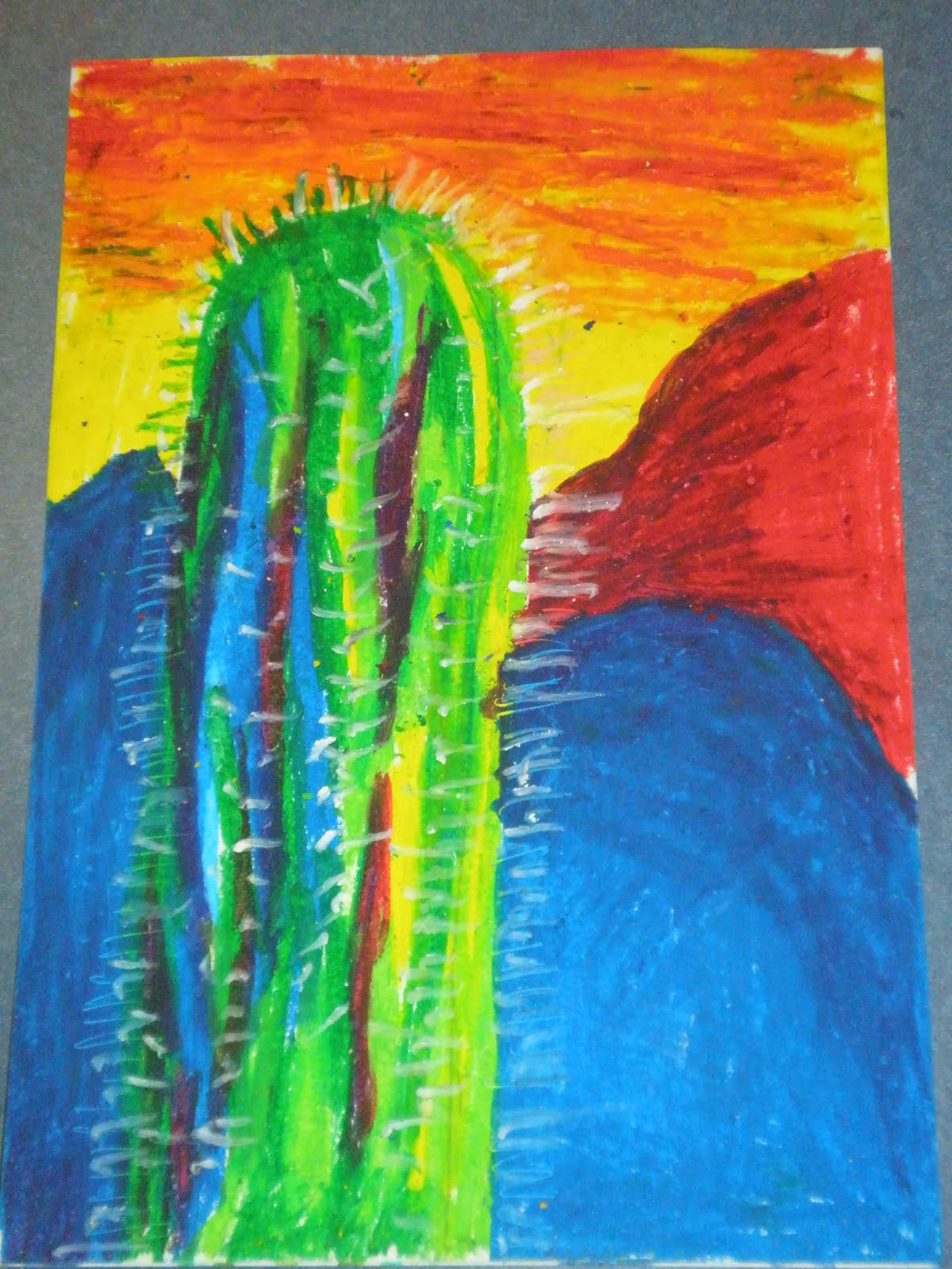
Year 3 Student Artworks:
 |
| By Andrea G, 2011 |
 |
| By Charlotte, 2011 |
 |
| Year 3 student, 2011 |
 |
| Year 3 student, 2011 |
 |
| By Denzelle, 2011 |
 |
| Year 3 student, 2011 |
 |
| By Nomvula. 2011 |
 |
| By Parth, 2011 |
 |
| some of the 3B artworks,2011 |
 |
| Year 3 student artwork, 2011 |